ant-customize-form
AntCustomizeForm
yarn publish AntCustomizeForm 1:安装 npm install ant-customize-form 或者 yarn add ant-customize-form 2:开箱即用,支持所有的 ant 组件属性 基本的使用
Content
- exampl1:show 表单联动
- exampl2:col 分列
- exampl3:rowNum 分列
- 1:AntCustomizeForm 介绍
- 2:组件类型
- 3:formBaseConfig 的基本配置
- 4:formItemConfig 的基本配置
- 5 show:表单联动的介绍
AntCustomizeForm 介绍
- 表单类型
- 支持复杂的表单联动控制
- 支持自定义组件
- 所有的组件都是基于 antd 表单组件,也支持自定义的组件
- 支持多列的情况的表单
 ##基本配置
  space?:表单要分成几列   Space间距分
  col?:表单要分成几列,默认值1列 栅格分
  formProps:对应form的属性
  formItemOption: @Form.item 的基本配置
    const formParan = {
        col: 2,//space
        formProps:formBaseConfig,
        formItemOption:formItemConfig,
        customize: {
            type1: <div>111</div> //字段key为typ1的自定义组件
        },
       formList: {
            type6: <BindFeeForm form={formRef} /> //针对与Form.List的情况
        }
    }
组件类型
export enum ItemTypes {
    TITLE = 'Title',
    INPUT = 'Input',
    SELECT = 'Select',
    CASCADER = 'Cascader',
    RADIO = 'Radio',
    TEXTAREA = 'TextArea',
    INPUTNUMBER = 'InputNumber',
    CHECKBOX = "Checkbox",
    UPLOAD = "Upload",
    DRAGGER = "Dragger",
    DATEPICKER = "DatePicker",
    RANGEPICKER = 'RangePicker',
    MOREITEM = 'MoreItem', //一个表单项支持多个输入框的
    BUTTON = 'Button',
    CUSTOMIZE = 'Customize' //自定义组件获取值
    LIST = 'List' //Form.List 的情况单独做处理
}
formBaseConfig
相当 Form 的 props
formBaseConfig的基本配置注意事项,其他配置遵循  antd的form配置
 const formBaseConfig = {
    labelCol: { span: 6 },
    wrapperCol: { span: 16 },
    // formRef必填
    form: formRef,
    onValuesChange: (changedValues?: any, values?: unknown): void => {
      console.log(changedValues, values, 1212132312);
    },
    //设置默认值
    initialValues: {
      ruleType: 1,
    },
  }
   1: const [formRef] = Form.useForm() // 注意只能使用 formRef
   2: formRef.setFields([{ name: 'name', value: 123 }, { name: 'read', value: 7878 }]) // 设置值的方法
   3: formRef.setFieldsValue({ [key:string]:123 }, { [key:string]: 7878 }) // 设置值的方法
formItemConfig
##  Form.item 的基本配置
          itemProps:对应 antd 的 <Form.Item></Form.Item> 的的属性
          type: 对应的当前使用的输入框类型  example  Input Radio 等
          children?:MoreItem子表单或者其他类型时的自定义文案,
           col?: 24,新增配置
          rowNum?:多少Form.Item为一行 example:  rowNum:2;
          typeProps:antd对应的输入框的配置属性     example: <Input {...typeProps}/>
          typeProps:{ onChange: (val: { target: { value: SetStateAction<string> } }) => {  //可以在onChange 设置其他表单的值
              formRef.setFieldsValue({
                type4: type4OptionsObj[val.target.value][0].value,
                });
          }};
          show:是否展示当前表单项 show: () => {
                                     return {
                                             dependencies: ['type1'],  //依赖对应
                                             flag: formRef.getFieldValue('type1') === 'Apple' //展示的条件
                                             }
                                  }

         const formItemConfig=[
                 // 阶段标题的配置
                 { itemProps: { ...layout }, type: 'Title', children: '基础信息', rowNum: 1, typeProps: { level: 4 } }
         ]
show
自定义表单 show 属性的介绍——-也是支持复杂动态表单的控制显示
- 1:一个表单控制的情况 例子联动类型 1:
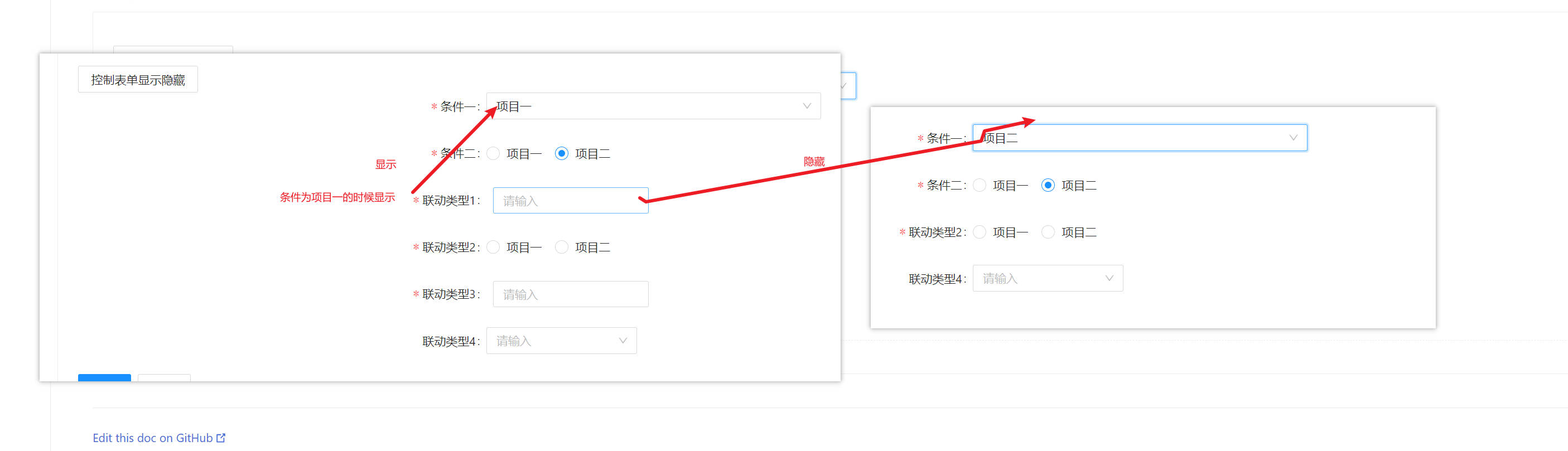
show: () => {
        return {
          dependencies: ['1'], //依赖项
          flag: formRef.getFieldValue('1') === 1, //显示的条件
        };
      },
- 2:boolen 控制表单的情况 例子联动类型 2:
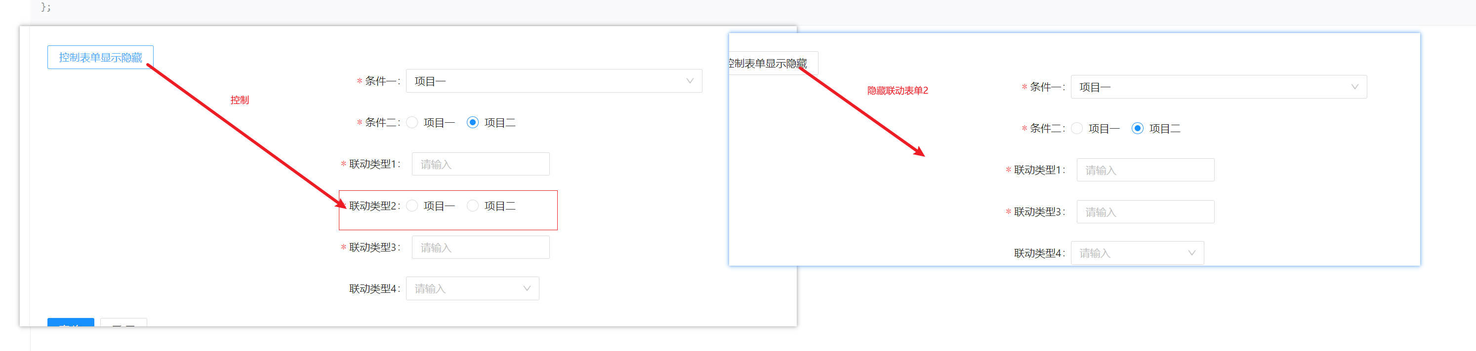
  const [isShow, setIsShow] = useState(true);
  show: isShow,
- 3:多个表单控制的情况 例子联动类型 3:
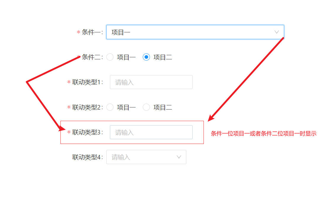
show: () => {
  return {
    dependencies: ['1', '2'], //依赖项
    flag: formRef.getFieldValue('1') === 1 || formRef.getFieldValue('2') === 1, //显示的条件
  };
};
- 4:子表单显隐控制的情况 例子联动类型 4:
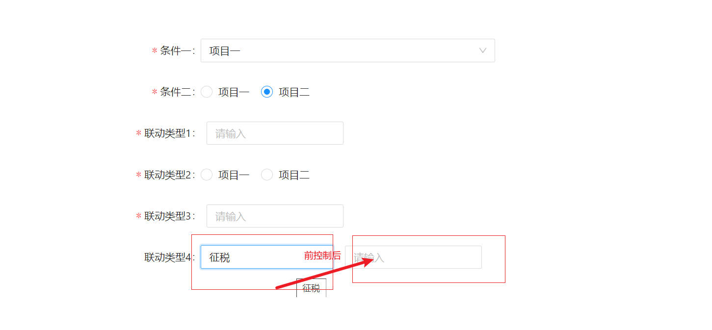
父表单:
show: () => {
  return {
    dependencies: ['taxRateType'], //嵌套表单的时候要把子表单的依赖写到父表单依赖中
    flag: true, //显示的条件也可以与其他表单联动
  };
};
children子表单:
show: () => {
            return {
              dependencies: ['taxRateType'], //依赖项
              flag: formRef.getFieldValue('taxRateType') === 1, //显示的条件
        };
};
- 5:其他表单控制 子表单显隐控制的情况 例子联动类型 5:
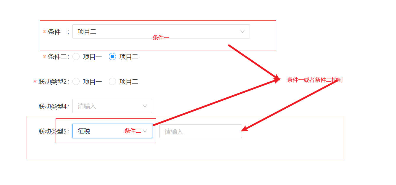
父表单:
show: () => {
  return {
    dependencies: ['taxRateType', '1'], //嵌套表单的时候要把子表单的依赖写到父表单依赖中
    flag: true, //显示的条件也可以与其他表单联动
  };
};
children子表单:
show: () => {
            return {
              dependencies: ['taxRateType'], //依赖项
              flag: formRef.getFieldValue('1') === 1 || formRef.getFieldValue('2') === 1, //显示的条件
        };
};
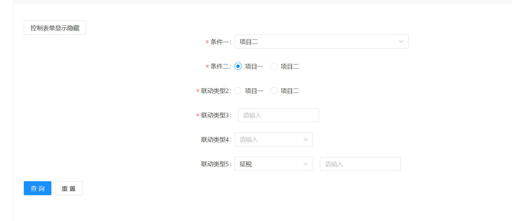
example1
###代码
import { CustomizeForm, ItemTypes, WFC } from 'ant-customize-form';
import { Button, Form } from 'antd';
import React, { useState } from 'react';
export default () => {
  const [formRef] = Form.useForm();
  const [isShow, setIsShow] = useState(true);
  // 相当于Form的props
  const formBaseConfig = {
    labelCol: { span: 6 },
    wrapperCol: { span: 16 },
    form: formRef,
    onValuesChange: (changedValues?: any, values?: unknown): void => {
      console.log(changedValues, values, 1212132312);
    },
    initialValues: { 1: 1, 2: 2 },
  };
  // 可以在onChange里面设置其他表单的值
  const formItemConfig = [
    {
      itemProps: { name: '1', label: '条件一', rules: [{ required: true }] },
      type: ItemTypes.SELECT,
      typeProps: {
        placeholder: '请输入',
        style: { width: 400 },
        options: [
          { label: '项目一', value: 1 },
          { label: '项目二', value: 2 },
        ],
      },
    },
    {
      itemProps: { name: '2', label: '条件二', rules: [{ required: true }] },
      type: ItemTypes.RADIO,
      typeProps: {
        placeholder: '请输入',
        style: { width: 400 },
        options: [
          { label: '项目一', value: 1 },
          { label: '项目二', value: 2 },
        ],
      },
    },
    {
      itemProps: { name: '3', label: '联动类型1', rules: [{ required: true }] },
      type: ItemTypes.INPUT,
      show: () => {
        return {
          dependencies: ['1'], //依赖项
          flag: formRef.getFieldValue('1') === 1, //显示的条件
        };
      },
      typeProps: {},
    },
    {
      itemProps: { name: '4', label: '联动类型2', rules: [{ required: true }] },
      type: ItemTypes.RADIO,
      show: isShow,
      typeProps: {
        options: [
          { label: '项目一', value: 1 },
          { label: '项目二', value: 2 },
        ],
      },
    },
    {
      itemProps: { name: '5', label: '联动类型3', rules: [{ required: true }] },
      type: ItemTypes.INPUT,
      show: () => {
        return {
          dependencies: ['1', '2'], //依赖项
          flag: formRef.getFieldValue('1') === 1 || formRef.getFieldValue('2') === 1, //显示的条件
        };
      },
      typeProps: {},
    },
    {
      itemProps: { label: '联动类型4' },
      type: ItemTypes.MOREITEM,
      show: () => {
        return {
          dependencies: ['taxRateType'], //嵌套表单的时候要把子表单的依赖写到父表单依赖中
          flag: true, //显示的条件也可以与其他表单联动
        };
      },
      children: [
        {
          itemProps: { name: 'taxRateType', rules: [{ required: true }] },
          type: ItemTypes.SELECT,
          typeProps: {
            options: [
              { value: 1, label: '征税' },
              { value: 2, label: '免征' },
              { value: 3, label: '不征税' },
            ],
            style: { width: 180 },
          },
        },
        {
          itemProps: { name: 'taxRate', rules: [{ required: true }] },
          show: () => {
            return {
              dependencies: ['taxRateType'], //依赖项
              flag: formRef.getFieldValue('taxRateType') === 1, //显示的条件
            };
          },
          type: ItemTypes.INPUT,
          typeProps: {},
        },
      ],
      typeProps: {},
    },
    {
      itemProps: { label: '联动类型5' },
      type: ItemTypes.MOREITEM,
      show: () => {
        return {
          dependencies: ['taxRateType1', '1'], //嵌套表单的时候要把子表单的依赖写到父表单依赖中
          flag: true, //显示的条件也可以与其他表单联动
        };
      },
      children: [
        {
          itemProps: { name: 'taxRateType1', rules: [{ required: true }] },
          type: ItemTypes.SELECT,
          typeProps: {
            options: [
              { value: 1, label: '征税' },
              { value: 2, label: '免征' },
              { value: 3, label: '不征税' },
            ],
            style: { width: 180 },
          },
        },
        {
          itemProps: {
            name: 'taxRate1',
            rules: [{ required: true }],
            labelCol: { span: 20, offset: 18 },
          },
          show: () => {
            return {
              dependencies: ['taxRateType1'], //依赖项
              flag: formRef.getFieldValue('taxRateType1') === 1 || formRef.getFieldValue('1') === 1, //显示的条件
            };
          },
          type: ItemTypes.INPUT,
          typeProps: {},
        },
      ],
      typeProps: {},
    },
    {
      itemProps: {},
      type: ItemTypes.BUTTON,
      typeProps: {
        linkBtnText: 1111,
        style: {
          marginLeft: 300,
        },
      },
    },
  ];

  const formConfig = {
    col: 1, //一行几列,支持多列的情况
    formProps: formBaseConfig,
    formItemOption: formItemConfig,
  };

  return (
    <>
      <Button
        onClick={() => {
          setIsShow(!isShow);
        }}
      >
        控制表单显示隐藏
      </Button>
      <CustomizeForm {...formConfig} />
    </>
  );
};
example2
##通过 col 进行分列 
import { CustomizeForm, ItemTypes } from 'ant-customize-form';
import { Form } from 'antd';
import React from 'react';
export default () => {
  const [formRef] = Form.useForm();
  // 相当于Form的props
  const formBaseConfig = {
    labelCol: { span: 6 },
    wrapperCol: { span: 16 },
    form: formRef,
    initialValues: {},
  };
  // 可以在onChange里面设置其他表单的值
  const formItemConfig = [
    {
      itemProps: { name: '1', label: '表单1', rules: [{ required: true }] },
      type: ItemTypes.INPUT,
    },
    {
      itemProps: { name: '2', label: '表单2', rules: [{ required: true }] },
      type: ItemTypes.INPUT,
    },
    {
      itemProps: { name: '3', label: '表单3', rules: [{ required: true }] },
      type: ItemTypes.INPUT,
    },
    {
      itemProps: { name: '4', label: '表单4', rules: [{ required: true }] },
      type: ItemTypes.INPUT,
    },
    {
      itemProps: { name: '5', label: '表单5', rules: [{ required: true }] },
      type: ItemTypes.RADIO,
      typeProps: {
        options: [
          { label: '项目一', value: 1 },
          { label: '项目二', value: 2 },
        ],
      },
    },
    {
      itemProps: { name: '6', label: '表单6', rules: [{ required: true }] },
      type: ItemTypes.TIMEPICKER,
      typeProps: {
        firstText: 1111,
        lastText: 2222,
      },
    },
    {
      itemProps: {},
      type: ItemTypes.BUTTON,
    },
  ];

  const formConfig = {
    col: 3, //一行几列,支持多列的情况
    formProps: formBaseConfig,
    formItemOption: formItemConfig,
  };

  return (
    <>
      <CustomizeForm {...formConfig} />
    </>
  );
};
example3
##通过 rowNum 属性的使用

import { CustomizeForm, ItemTypes } from 'ant-customize-form';
import { Form } from 'antd';
import React from 'react';
export default () => {
  const [formRef] = Form.useForm();
  // 相当于Form的props
  const formBaseConfig = {
    labelCol: { span: 6 },
    wrapperCol: { span: 16 },
    form: formRef,
    initialValues: {},
  };
  // 可以在onChange里面设置其他表单的值
  const formItemConfig = [
    {
      itemProps: { name: '1', label: '表单1', rules: [{ required: true }] },
      rowNum: 1,
      type: ItemTypes.INPUT,
    },
    {
      itemProps: { name: '2', label: '表单2', rules: [{ required: true }] },
      rowNum: 2,
      type: ItemTypes.INPUT,
    },
    {
      itemProps: { name: '3', label: '表单3', rules: [{ required: true }] },
      type: ItemTypes.INPUT,
    },
    {
      itemProps: { name: '4', label: '表单4', rules: [{ required: true }] },
      type: ItemTypes.INPUT,
    },
    {
      itemProps: { name: '5', label: '表单5', rules: [{ required: true }] },
      type: ItemTypes.RADIO,
      typeProps: {
        options: [
          { label: '项目一', value: 1 },
          { label: '项目二', value: 2 },
        ],
      },
    },
    {
      itemProps: {},
      type: ItemTypes.BUTTON,
    },
  ];

  const formConfig = {
    col: 3, //一行几列,支持多列的情况
    formProps: formBaseConfig,
    formItemOption: formItemConfig,
  };

  return (
    <>
      <CustomizeForm {...formConfig} />
    </>
  );
};
example4
##通过 CUSTOMIZE 属性的使用
import { CustomizeForm, ItemTypes, WFC } from 'ant-customize-form';
import { Form, Input } from 'antd';
import React from 'react';
import { useContext, useEffect, useState } from 'react';
const Type1Customize = (props: { treeData: any; width: string; disabled: boolean }) => {
  const { formProps, onChange: oldOnChange, value: deValue } = useContext(WFC) as any;
  const { treeData, width, disabled } = props;
  const [value, setValue] = useState<string>(deValue);
  const onChange = (newValue: string) => {
    oldOnChange(newValue); //最后的结果值通过onChange传给表单
    setValue(newValue);
  };
  useEffect(() => {
    setValue(deValue);
  }, [deValue]);
  return (
    <div>
      自定义 <Input onChange />
      测试
    </div>
  );
};

export default () => {
  const [formRef] = Form.useForm();
  // 相当于Form的props
  const formBaseConfig = {
    labelCol: { span: 6 },
    wrapperCol: { span: 16 },
    form: formRef,
    initialValues: {},
  };
  // 可以在onChange里面设置其他表单的值
  const formItemConfig = [
    {
      itemProps: { name: 'type', label: '自定义组件', rules: [{ required: true }] },
      type: ItemTypes.CUSTOMIZE,
    },
    {
      itemProps: {},
      type: ItemTypes.BUTTON,
    },
  ];

  const formConfig = {
    col: 3, //一行几列,支持多列的情况
    formProps: formBaseConfig,
    formItemOption: formItemConfig,
    customize: {
      type: <Type1Customize />, //字段key为typ1的自定义组件
    },
  };

  return (
    <>
      <CustomizeForm {...formConfig} />
    </>
  );
};